Dear Sir,
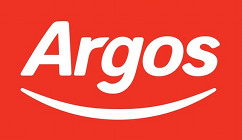
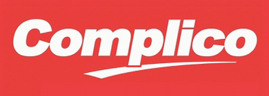
I was on the Argos website the other day, and noticed a startling similarity between the new Argos logo, and the Complico logo from The Peter Serafinowicz Show.

Complico

Argos
Could they by any chance be related?
Yours,
John Hoare
P.S. God, it’s shit.
(With apologies to @divaschematic.)

3 comments
Ben Paddon on 19 February 2010 @ 8pm
My word, that is a shit logo.
John Hoare on 20 February 2010 @ 12pm
Worst thing is, I *think* I can see the logic they’re going for – they want to give off the impression that their goods are dirt-cheap, in these “difficult economic times”. Maybe it’ll work for them, I don’t know.
It *is* horrible, though. And the swoosh is so ridiculously overused in logos these days it’s not even funny.
John Hoare on 5 March 2010 @ 8am
A more positive write-up than I would have given it, but interesting nonetheless:
http://www.underconsideration.com/brandnew/archives/facing_another_smile.php
I hugely recommend Brand New, by the way. An excellent site.
Comments on this post are now closed.