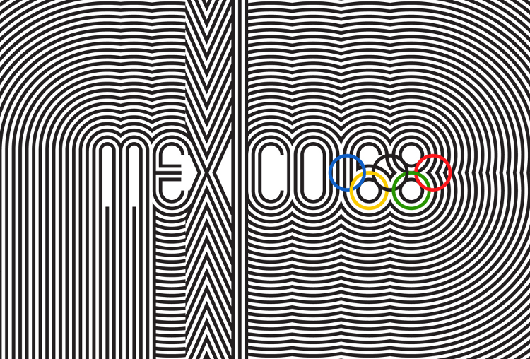
I love Brand New. Describing its purpose as to “chronicle and provide opinions on corporate and brand identity work”, a huge part of the site simply presents logos before a redesign and after, and invites comparisons. You could get lost in those archives for hours.
However, I have to – admittedly belatedly – take issue with the following post – New University of the Arts London Logo, or Why I Hate Helvetica. Click the link, read the article, especially the rant at the bottom – I’ll wait.
Back? Good. Now, first thing’s first. I don’t really care for that design. (The underlines on the guide and directory are particularly hideous.) And whilst I rather like Helvetica, I probably wouldn’t choose it for many applications these days – if only because, yes, it’s probably been over-used at this point.
No, what I take objection to with that argument is the essential premise: that something 50 years old has definitely been improved upon. I could give plenty of arguments against this – although throwing in Shakespeare feels rather like a new variant of Godwin’s law – so I’ll just use the following relevant example: the famed Mexico ’68 Olympics identity, widely regarded as one of the finest pieces of graphic design ever.

The fallacy here is simple: not everything gets better. And I fully admit the corollary: not everything gets worse.
Blind nostalgia is a very bad thing. That way lies people saying that everything was lovely in the old days, and blocking their ears at the very mention of things such as backstreet abortions. But so is a blanket dismissal of the past – the assumption that because something is old, it has definitely been improved upon.
Maybe it has. Maybe it hasn’t. But it’s certainly not a given.

2 comments
Dave Jeffery on 13 July 2012 @ 5am
I’d never describe Helvetica as a 60s face. It really arrived in mid-1968 with the cover of “The BEATLES” and the appearance of THAMES and Yorkshire Television and then in 1969 Hipgnosis’ wonderful HARVEST logo for EMI. If you look at the magazine scans on Gypsy Creams or in old TV Times you see Helvetica appear out of nowhere to replace the very similar looking Grotesques from 68 onwards to become ubiquitous in the 70s. One thing that really gets on my nerves is seeing Helvetica being used too early in films or television programmes set in the 60s or even 50s.
So it was as a “60s font” that missed all but 18 months of the decade – it defined the 70s far more than the 60s. And it was originally designed it in the 50s.
Dave on 25 August 2012 @ 11am
My eyes hurt.
Comments on this post are now closed.